Role: Concept, Research, UX, UI, Branding, Interactions, Visuals
Skills: Product Design, UI/UX Design, Wireframing, Prototyping, Figma, Adobe XD
Duration: September – October 2022
Project
Camp Davis is the landing website for an Airbnb host. The website is designed to inform guests of local events, restaurants, hikes, and locations. Also, Camp Davis’ website shares the cabin’s history and family with its guests to build a positive connection.
Challenges
- Design a cohesive interface for familiar and unfamiliar users.
- Eliminate barriers to outsourcing links.
- Allow users to access the host’s online platforms.
- Create a minimalistic UI while supplying ample information.
Brainstorm
Before starting my work on Camp Davis, I wanted to have an idea of what our website would include and where our projected outcomes were. I was able to narrow the questions down to the following:
What resources does Camp Davis supply?
What other platforms are affliated with the products?
Who is the primary target audience?
What are the goals of the website?
What is the product and how does it relate to the purpose?
What challenges could we face moving forward?
Preliminary Ideation
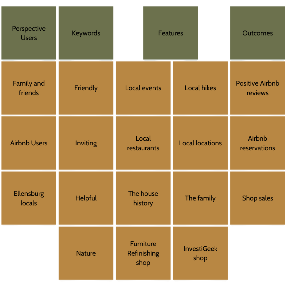
I used affinity mapping to not only map out the general theme of Camp Davis, but it also helped me identify my main focal points in building the website. After analyzing my questions related to Camp Davis, I was able to draw conclusions as to which direction I could navigate Camp Davis.
Meet the Users
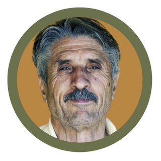
Primary
Name: Dave
Age: 61
Occupation: Farmer

Secondary
Name: Lindsey
Age: 22
Occupation: Student
Dave is a Washington farmer, who is visiting the Kittitas County Fair and Rodeo with his wife. His adult children are also visiting from nearby towns, so Dave wants an Airbnb where he can host campfires and dinners.
Lindsey is a university student visiting friends at Central Washington University. She wants to stay at a place in Ellensburg away from others. Since her friends live in apartments, she wants to book an Airbnb that is a single building big enough to host her friends.
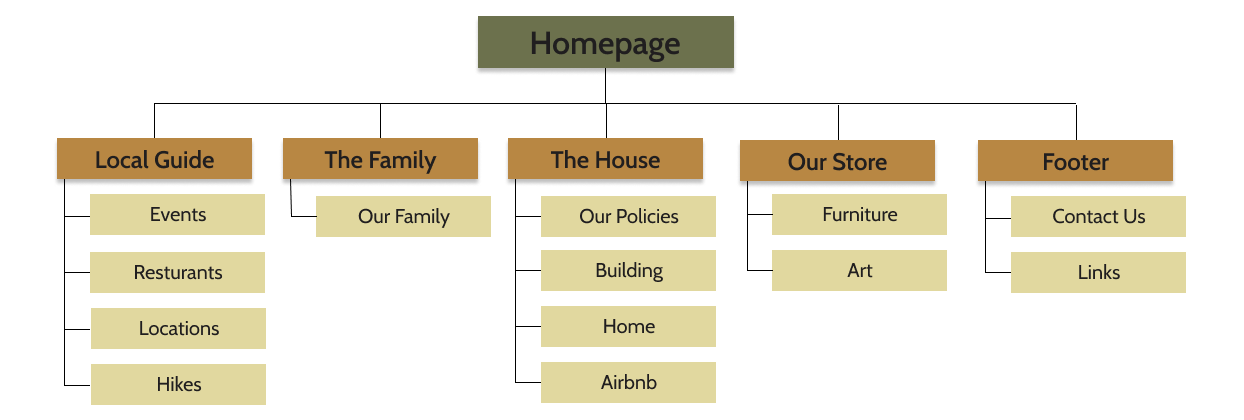
Sitemap
It was important to maintain a landing page, but there also was an emphasis on easy navigation for the remainder of the website. By establishing a navigation bar that is easily accessible, anyone can navigate to their destination within Camp Davis.
Low-Fidelity Wireframe
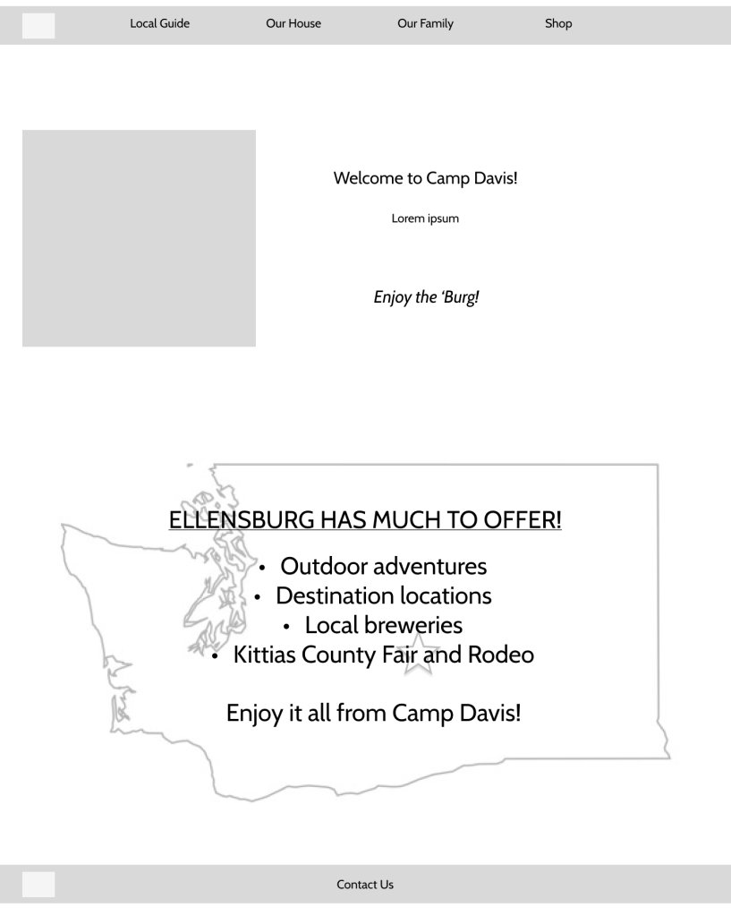


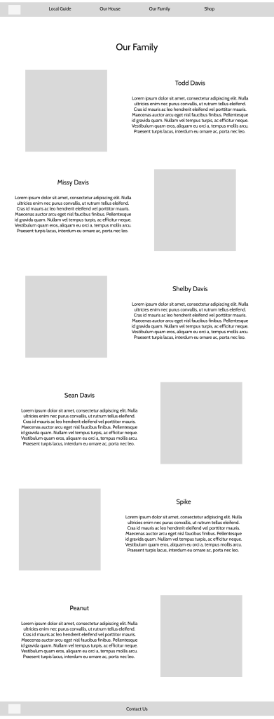
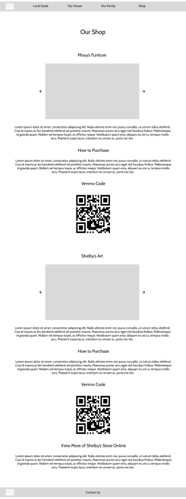
After creating Camp Davis’ wireframe, I had a general idea of how the website would function and how I could style the brand in a cohesive, inviting manner.
Branding Kit
I created a brand kit orientated around the colors of wildflowers since both Camp Davis and the family’s history are closely tied to nature. By using neutral, yet colorful, tones, Camp Davis demonstrates an inviting and natural experience. I also incorporated fonts that relayed the same inviting demeanor since they are sans serif fonts with subtle shapes.

Takeaways
Since Camp Davis was my childhood home, this project was quite literally home for me. I wanted to build a website that shared both my family’s history along with our favorite locations in Ellensburg and I was able to fulfill both of these goals. Building Camp Davis also gave me more experience with building a website from scratch on WordPress. The main problem I faced was using a minimalistic approach while I was filled with so much information on the topic. I know I have a lote more to learn as a self-taught UX Designer and I hope I am able to edit Camp Davis as I grow through experiences.
Disclaimer: This project was created purely for fun and as a creative exercise. The customer personas are fictional, and no website was developed.
